- Stephosmanski
- Design 4 Good
- Clean Water For Haiti
- Beethoven's Fifth
- Natkaya Digital Media Internship
- Samus
- Choose Your Own Ending
- Frogs
- Game
- 3D Character
- Pinball Machine
- Locomotive Train
Portfolio Pieces ☰
Beethoven's Fifth
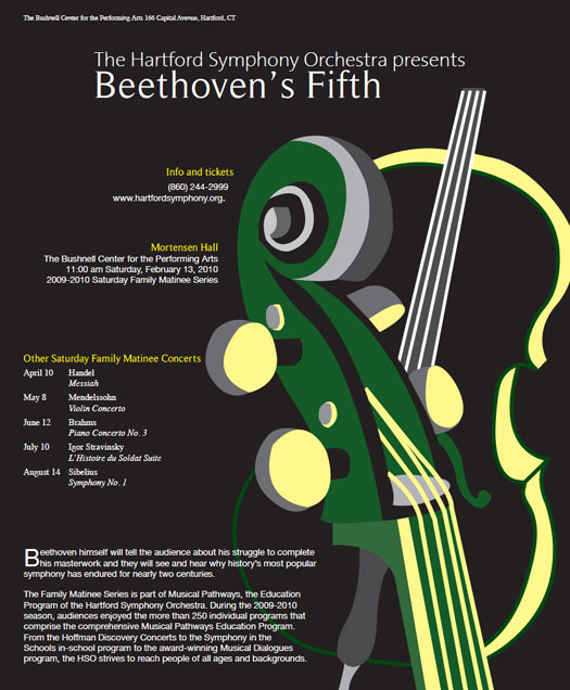
Typography is very important in all aspects of design and so is grid structure. By using both of these techniques I designed this poster for an orchestra symphony. I was only allowed to use three colors. To get around this I changed the hue of colors which gave it the effect of more colors, than just three.